Toy rental app
mobile app
Component-Based design of a Mobile App for Renting Toys
Client
School Project, Chalmers
Category
Product Design
Service
UI, UX
Period
Fall 2024
Encouraging reuse through accessible design.
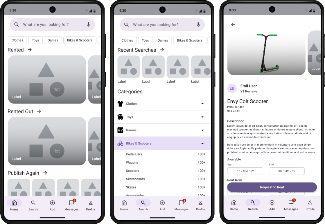
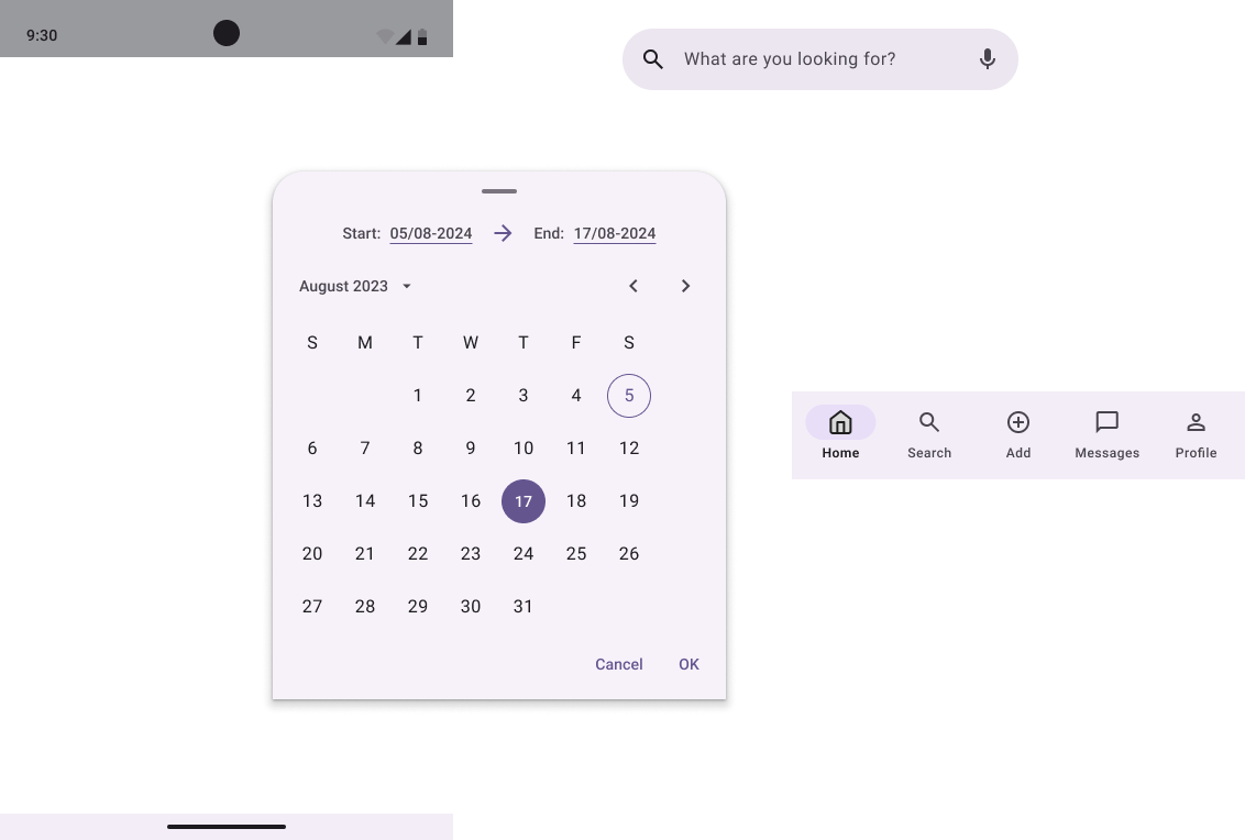
The project involved designing a mobile app following Material Design guidelines, focused on enabling families to rent and rent out children’s amenities such as clothes, toys, games, and bicycles or scooters. A key UX challenge was designing an experience that felt trustworthy, simple, and familiar, while still supporting a broad range of items and user needs. Because the app relies on users both lending and borrowing, the interface was intentionally modeled on patterns from similar sharing and marketplace apps to reduce friction and shorten the learning curve. The design aimed to balance ease of use with sustainable impact, encouraging resource sharing as a natural and accessible alternative to buying items that would soon go unused.
component based design
Component-based design was central to how I built the mobile app interface. Working in Figma with the Material 3 Design Kit, I structured the UI around reusable components rather than individual screens, which allowed me to design with consistency and speed. Treating components as the foundation of the interface made iteration straightforward and ensured that visual and interaction patterns stayed aligned as the design evolved. This approach gave me better control over the system as a whole and resulted in an interface that feels cohesive, scalable, and ready for implementation.
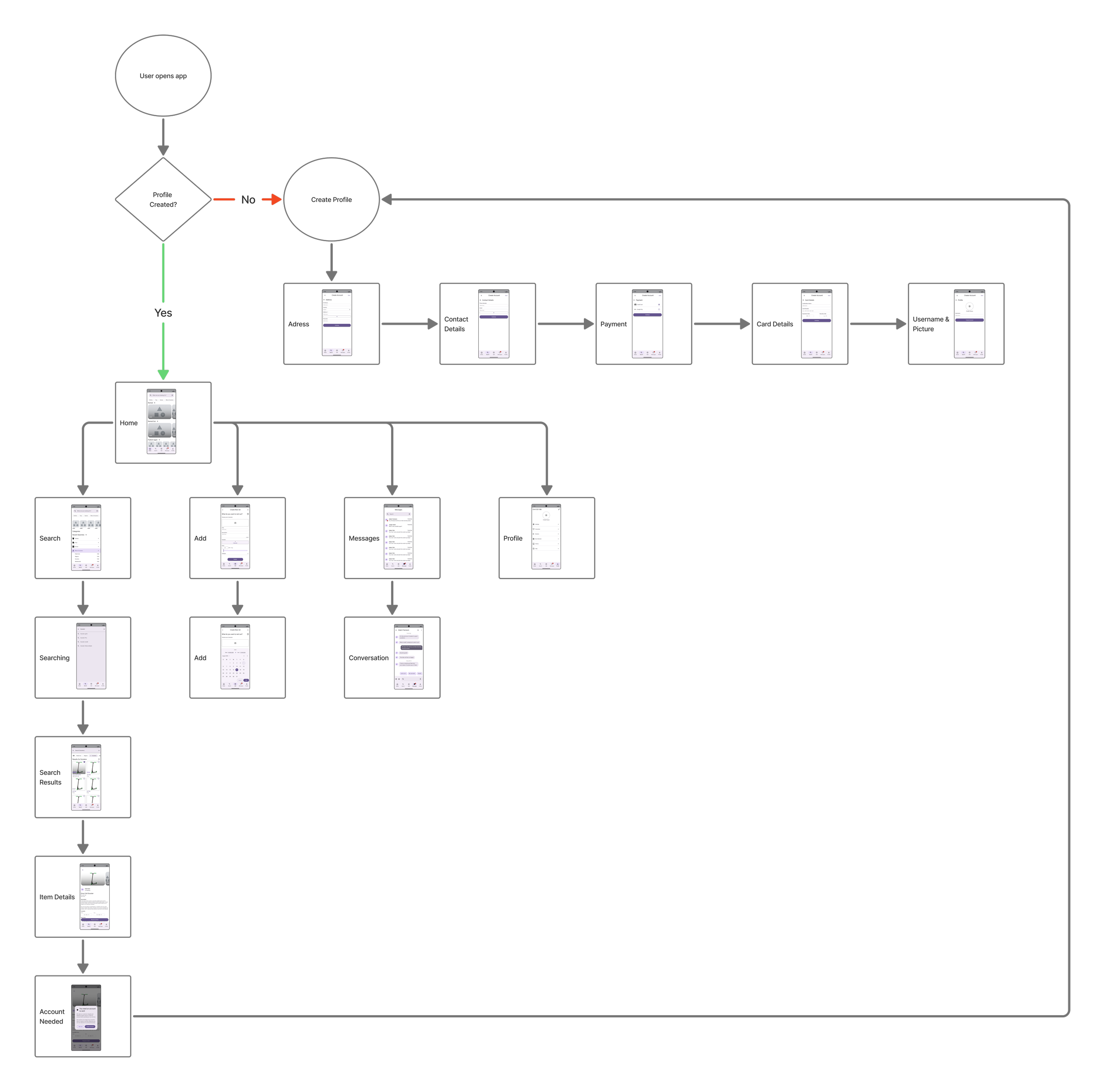
User flow
What was the result?
-
This project gave me hands-on experience designing a mobile app where usability, clarity, and familiarity were central to the experience. Working within a rental-based system highlighted the importance of clear structure and recognizable patterns to support both browsing and listing items. It also made me more aware of how decisions around visual hierarchy, component usage, and navigation shape the overall coherence of an interface.
-
I strengthened my skills in mobile UI and UX design, information architecture, and component-based design using Material Design guidelines. Designing for multiple item categories and user roles improved my ability to organize content and guide users through complex flows. At the same time, the project revealed opportunities to refine the interface further by simplifying layouts and relying on fewer, more consistent components.
-
Going forward, I aim to work with an even clearer visual and interaction direction and to explore simpler interface solutions with fewer components. The project reinforced the value of restraint in UI design and has influenced how I approach future mobile projects, with a stronger focus on clarity, consistency, and purposeful use of design systems.