cstrider
mobile app
Human-Centered Design of a Wireless Ferry Control App
Client
Cstrider
Category
Product Design
Service
Visual Design, UX
Period
Spring/Summer 2025
Designing with users in mind ensures that technology supports, rather than complicates, their work.
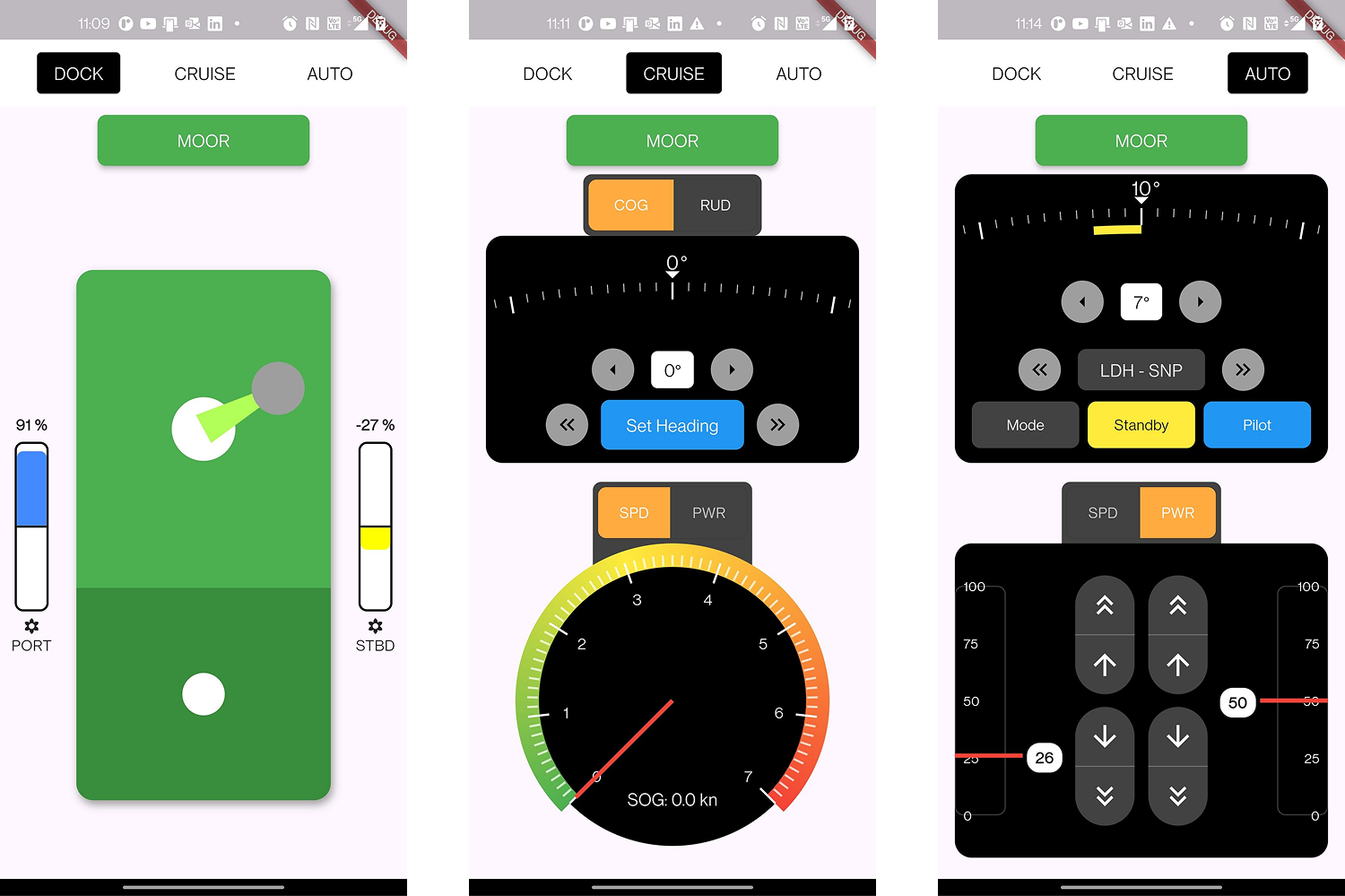
This work was done in close collaboration with Cstrider, a company pioneering small, modular ferries that are sustainable, semi-autonomous, and optimized for narrow waterways. They envisioned a mobile-based helm system to replace traditional control stations on ferries. This raised unique challenges: how do we recreate tactile, safety-critical helm controls in a handheld device without compromising situational awareness or control precision?
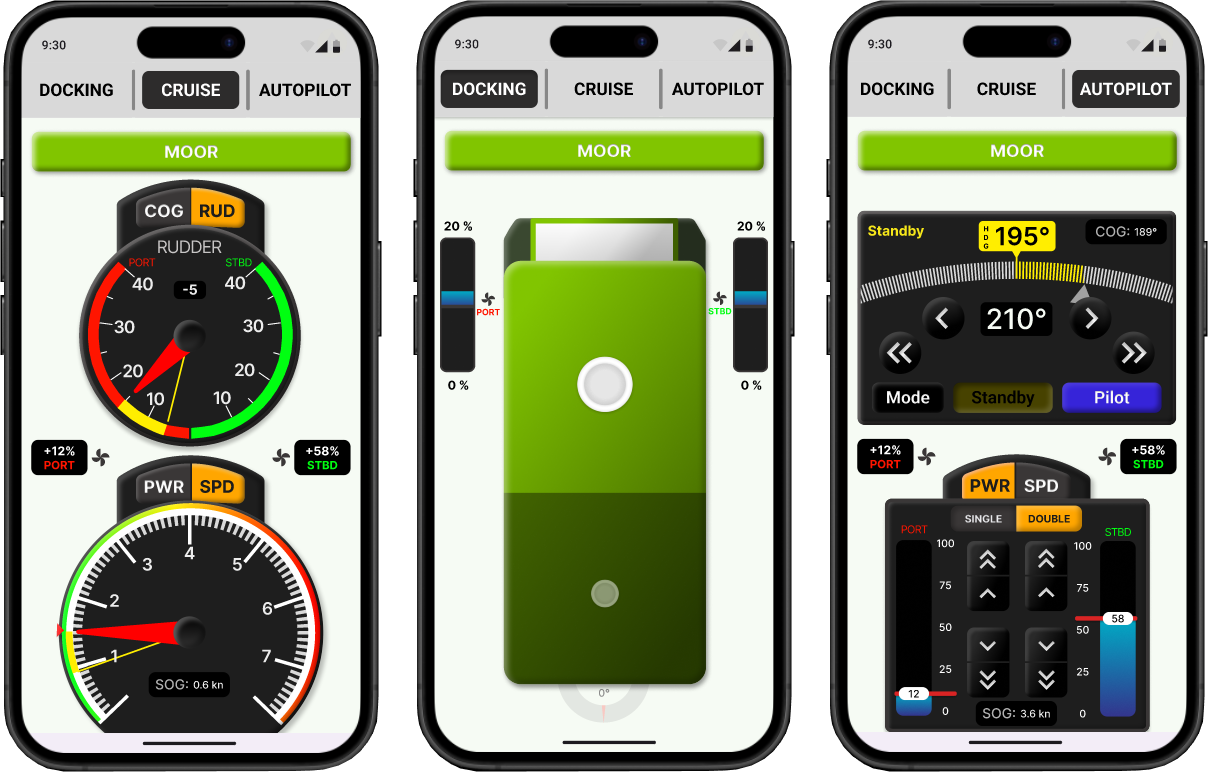
What you see above is the final solution. A mobile phone application focusing on simplicity, intuitive controls, traditional visual metaphors, and minimal attentional demand. The design was made in Figma and later a semi-functional prototype was made using Flutter.
research
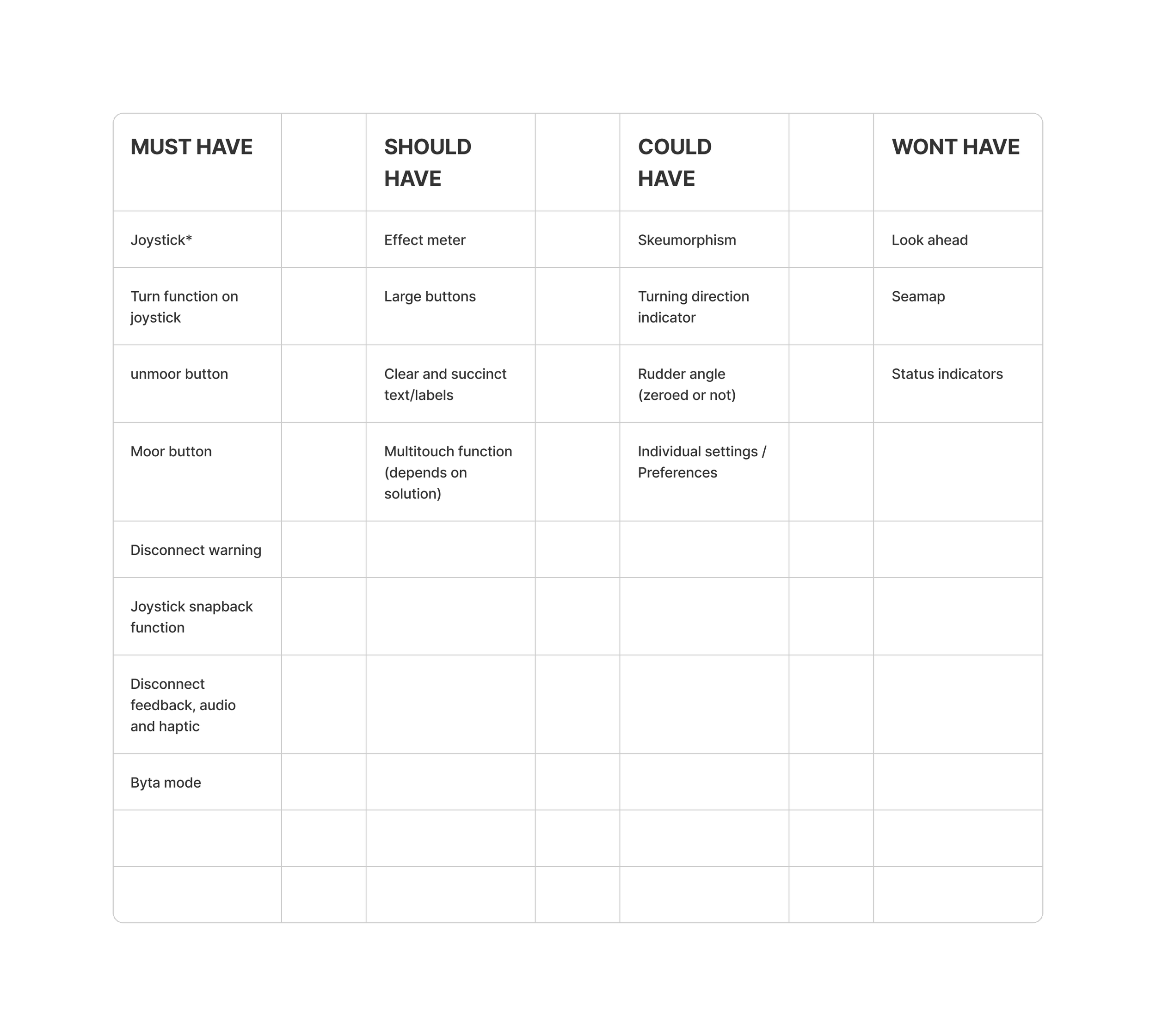
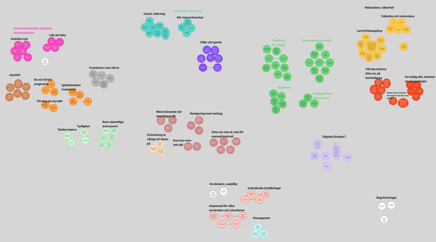
The research journey began with a deep dive into existing studies and literature, then continued with interviews to hear directly from ferry operators about their challenges and needs. Using thematic analysis, we uncovered patterns in how they interact with complex controls, and the MoSCoW method helped prioritize what really mattered. These insights guided the design of a wireless ferry navigation system that’s intuitive, reliable, and built around real user experiences.
Ideation
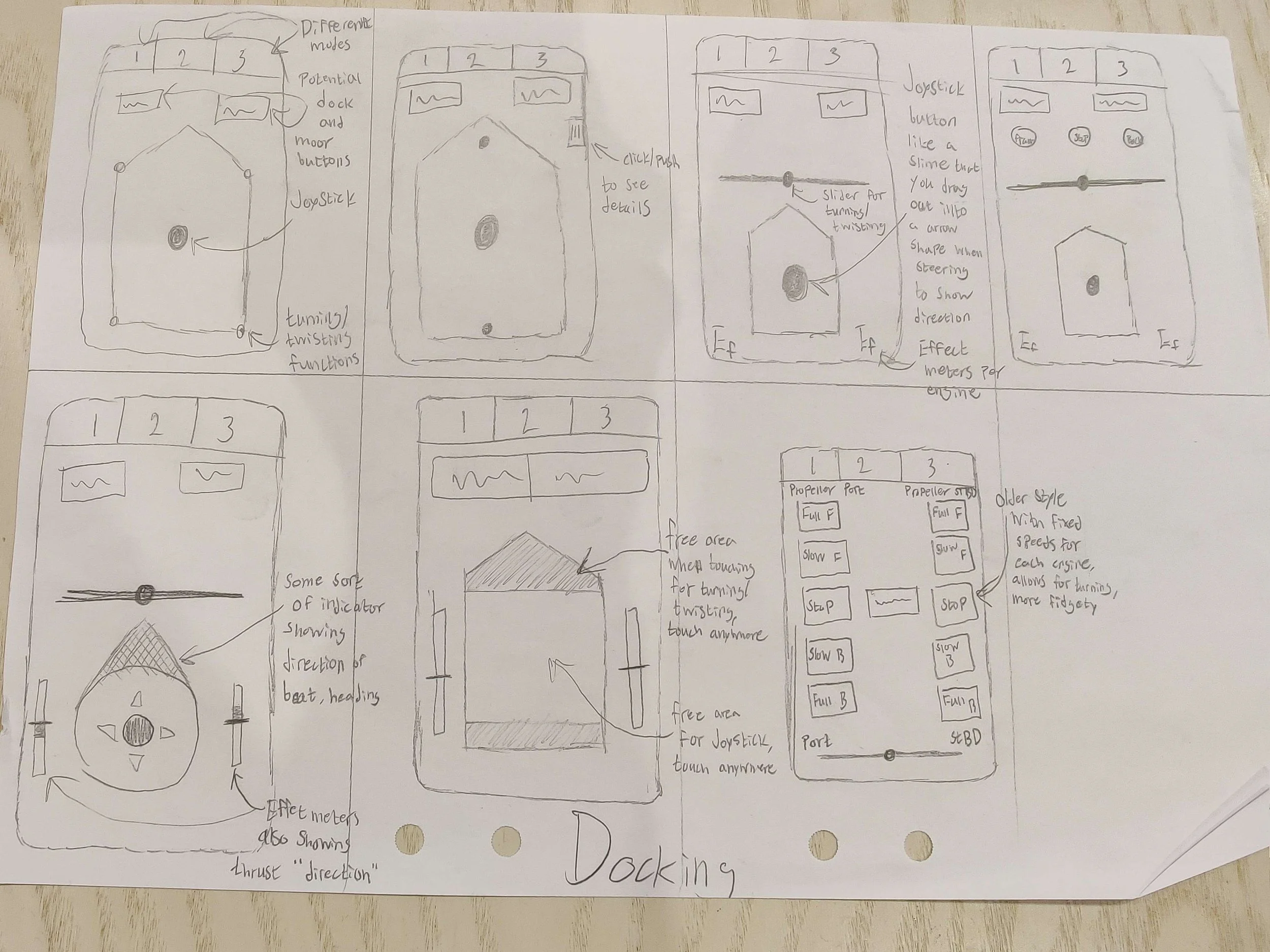
The ideation phase focused on transforming insights into design concepts through sketching, wireframing, and participatory design sessions. By involving users early, we could explore different interaction models and quickly see what felt intuitive or confusing. This iterative process of creating, testing, and refining laid the groundwork for a navigation app that balanced safety with simplicity, while staying true to real user needs.

Prototyping
In the prototyping phase, we refined the Figma designs through iterative feedback while at the same time developing a more functional version in Flutter. This dual process allowed us to test interaction flows and visuals quickly in Figma, while also exploring how the design translated into a working mobile application. By improving both in parallel, we could evaluate usability, refine details, and ensure the final navigation app felt both intuitive in concept and practical in use.
Evaluation
The evaluation phase focused on testing how well the prototype worked in practice. We combined quantitative methods, such as the System Usability Scale (SUS) and NASA-TLX for measuring workload, with qualitative feedback through interviews. This mix provided both numbers to benchmark usability and deeper insights into how users experienced the system. The results highlighted strengths, revealed areas for improvement, and ensured the final design was not only functional but also intuitive and user-friendly.

What was the result?
-
This project concerns a particular user group and therefore the design had to be highly adapted to these potential users. It required delving deep into unfamiliar concepts and areas related to ship operation. The frequent meetings and interviews proved instrumental for the design, especially considering the expert-level knowledge oftentimes required. Applying my existing skillset in a new environment and navigating challenges such as the cognitive disorientation on the boat has been an immensely rewarding experience.
-
Through this project my knowledge of Figma and Flutter, especially Figma, has improved and grown in both depth and width. The problem required a solution that could not be adequately solved with traditional UI visuals and that lead me down a path of creating more haptic control visuals which often required a bit of creativity and struggle to design for.
-
At the final end of the project in August 2025, Cstrider are at the beginning of their on-boat testing with our application.